Typography

Consistent use of typography is the foundation of the Iowa State brand standards. Our graphic communications reach many overlapping audiences and it is important that the university’s image is reflected clearly and consistently in all situations. Careful use of typography establishes a unique graphic look that is instantly identified with Iowa State, creating a cohesive, professional image.
Two type families have been carefully selected for graphic communications: ITC Berkeley Old Style and Univers. These two type families, highly versatile and highly legible, are compatible with each other as well as with our wordmark. ITC Berkeley is a traditional serif typeface. Univers is a sans serif typeface with a clean, modern look. Together, they reflect these two traits that embody Iowa State University. The wide range of weights available in both families provide several options necessary to create an effective typographic message. The font families may be used alone or in combination to create graphical interest.
When creating electronic communications, such as emails and e-newsletters like MailChimp or Constant Contact, use Times New Roman or Arial, if ITC Berkeley Old Style and Univers aren’t available.
If using Adobe Express for any application, use Arial in place of Univers and Merriweather in place of Berkeley.
The university and Monotype, the company who holds the rights to Univers and ITC Berkeley Old Style font families, have negotiated a financial agreement which will allow university units to access a package of 25 brand identity fonts in the two families at no charge. The font packages are only available for university owned employee computers. Contact your local IT for accessing the Univers/ITC Berkeley Old Style package of 25 fonts. The fonts are shown below.
-
Print
Print communications fall into many categories, from printed brochures, posters, and banners to signage, apparel, and billboards. Both ITC Berkeley Old Style and Univers are approved for use in print communications.
Some items to keep in mind when choosing your typography include:
- Use only fonts included in the Berkeley and Univers type families. A combination of approved fonts can be used as graphical elements within a piece.
- If you need to reverse copy out of a color, choose one of the darker colors in the palette, and use Univers at a point size large enough to keep the letterforms from filling in. Berkeley should be used with caution in reverse out situations.
- A comfortable standard for body copy is Berkeley set at 10 point on 14 point leading or Univers set at 9.5 point on 14 point leading.
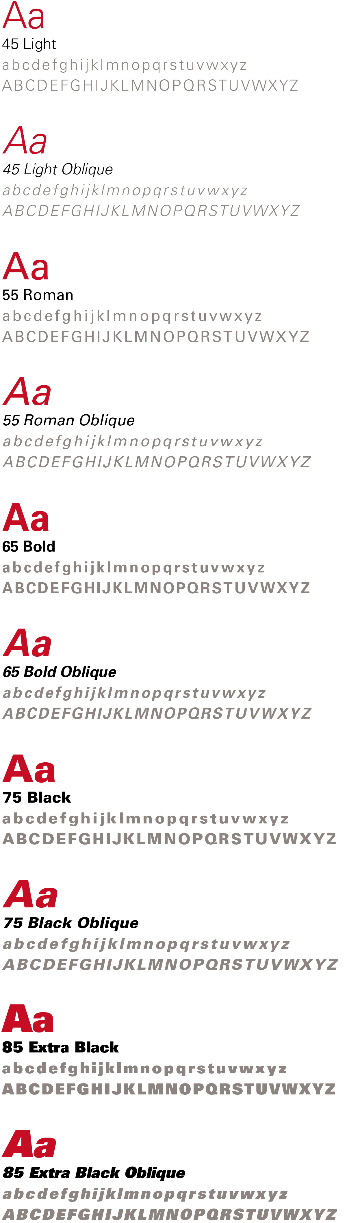
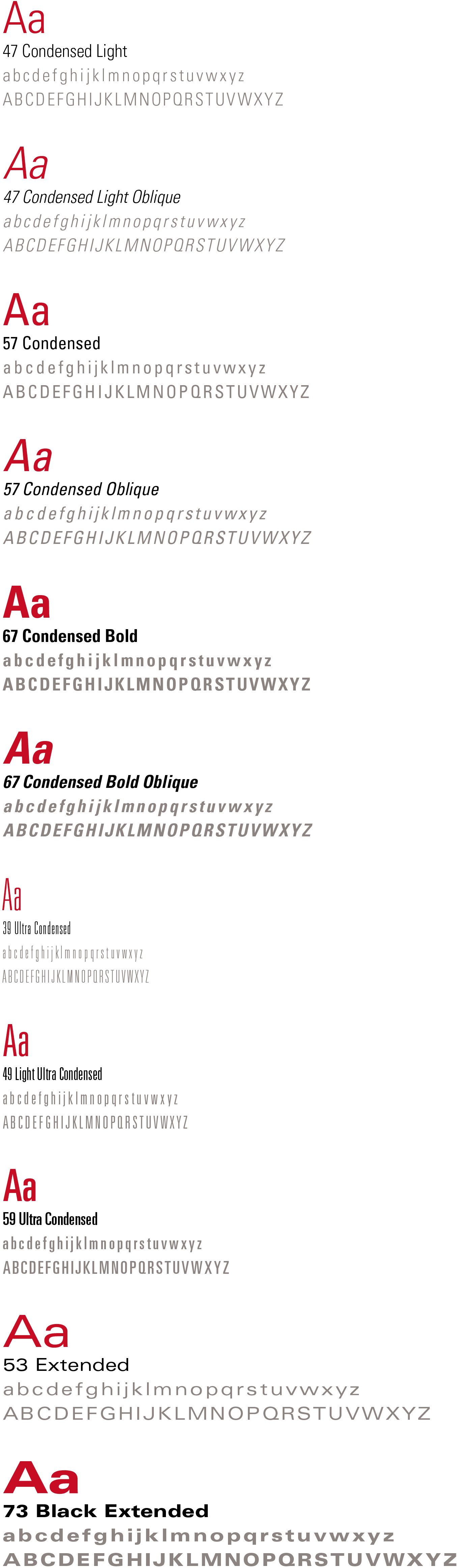
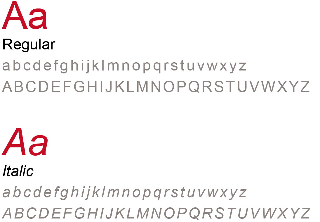
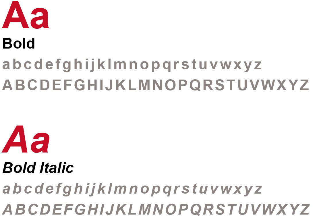
Univers Font Family
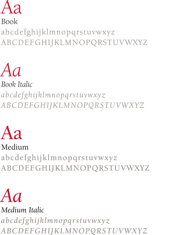
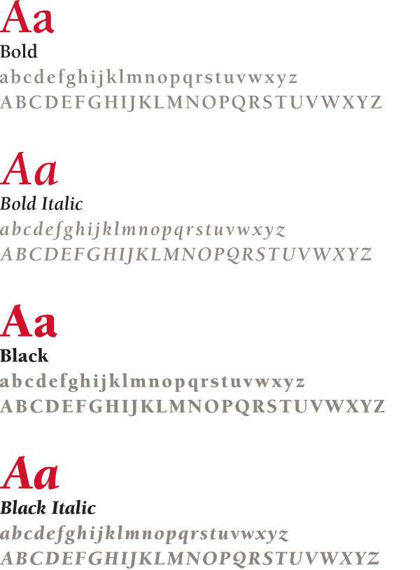
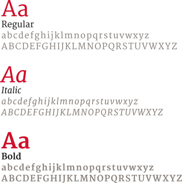
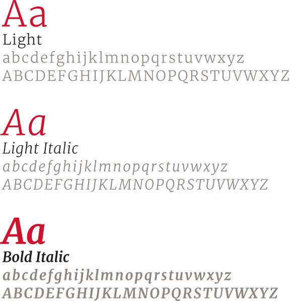
ITC Berkeley Oldstyle Font Family
-
Web
While Berkeley and Univers work well in print communications, due to technical limitations of websites, two different fonts that share some of the same characteristics of Berkeley and Univers have been carefully chosen for use in online resources.
The digital font replacements are Arial (for Univers) and Merriweather (for Berkeley). These fonts can be viewed on most browsers. Merriweather can be utilized by designers and developers through Google Fonts. Arial is a system font. Additional information about using typography with the Iowa State web theme is available on page 21 of the Web Style and Story Guide.
The university no longer has a licensing agreement for Nimbus Sans as a university brand web type font. It has been replaced with Arial, a type font that is easily accessible. If you are making any updates to your web sites, you will need to check the flow of your text, since there is some variation between Nimbus Sans and Arial. The change was applied to the university’s web theme in an update. If your site is supported by an internal web team or a third-party vendor, make sure theme updates are applied on a regular basis and that their implementation works correctly.
Arial Type Family
Merriweather Type Family
-
Electronic
While Berkeley and Univers work well in print communications, due to technical limitations of electronic presentation software, two different fonts that share some of the same characteristics of Berkeley and Univers have been carefully chosen for use in electronic presentations and communication when our brand fonts aren't available.
Times New Roman Type Family
Arial Type Family