Primary Wordmarks
Remember Cyclone fans, yellow or gold paper with black ink is never a good combination!
The Iowa State University wordmark and its configurations detailed in these guidelines are the only acceptable graphic identification for the university and its colleges, units, institutes, or centers. Do not attempt to typeset or recreate the wordmark. Instead, the university-created digital file should be used. NO OTHER LOGOS, SYMBOLS OR TYPE TREATMENTS should be developed or used by colleges, departments, divisions, units, centers or institutes as they distract from the emphasis and identity of the university. The primary wordmarks are the preferred version and can be recognized with the one-line format. (Please note, wordmarks for download are vector PDFs appropriate for all digital and print uses. If a reverse version is desired, please change spot color to white.)
Official name wordmark:

Abbreviated name wordmark:
![]()
The primary wordmark may be used with the official name “of Science and Technology”. Reasons to use the official name wordmark include:
- When communicating with audiences that are specifically interested in our programs dealing with science and technology
- When a communication is targeting a specific science and technology related audience
- When submitting a grant proposal
- When creating official documents on behalf of the university
The primary wordmark may be used without the official name “of Science and Technology”. Reasons to use the abbreviated name wordmark include:
- When communicating with prospective students who may be interested in degrees in fields other than science or technology
- When communicating with audiences with whom the modifier does not strengthen our reputation
- A college or unit’s name is positioned below the wordmark
- Simplicity of design
-
Alignment
The alignment options for the primary wordmark are left alignment or center alignment, dependent upon the alignment of the surrounding content.
Center
Left

-
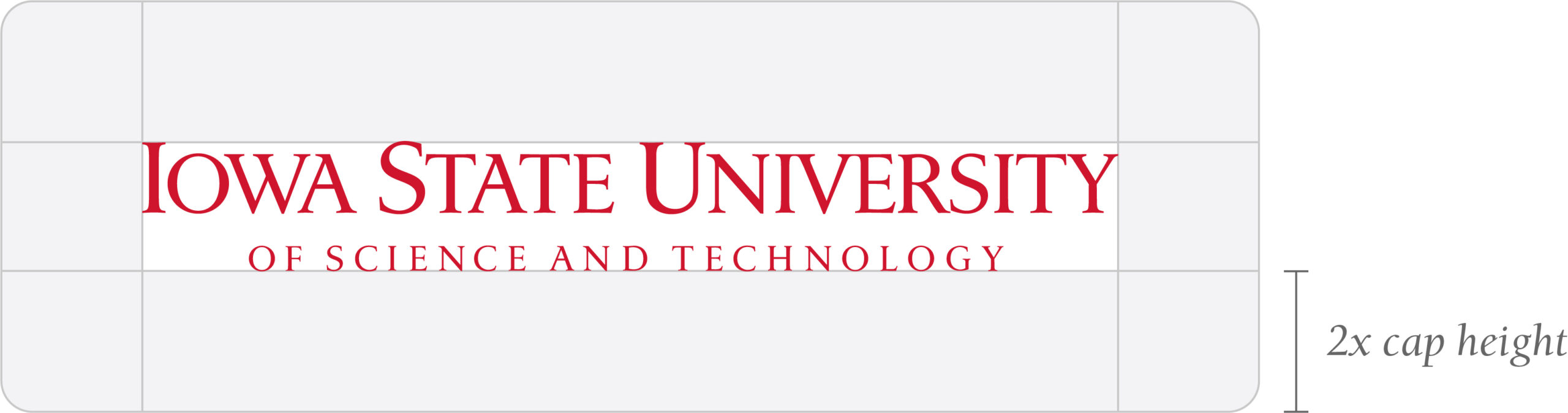
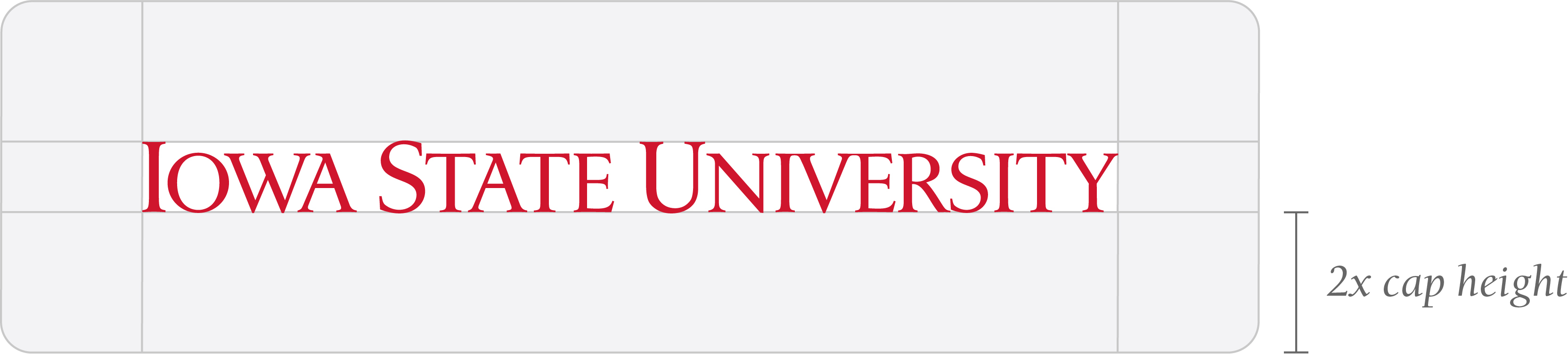
Area of Isolation
An area of isolation must be utilized for the wordmark to achieve maximum visual impact. Do not place type, photos, or any other high contrast elements within this area. The area of isolation represents the space surrounding all four sides of the wordmark graphic and can be measured using 1/2 of the height of the letter “I” in “Iowa” of the university wordmark.
Official Name Wordmark

Abbreviated Name Wordmark
-
Color
Only the following colors should be used in the wordmark. These colors preserve the integrity of
our identity.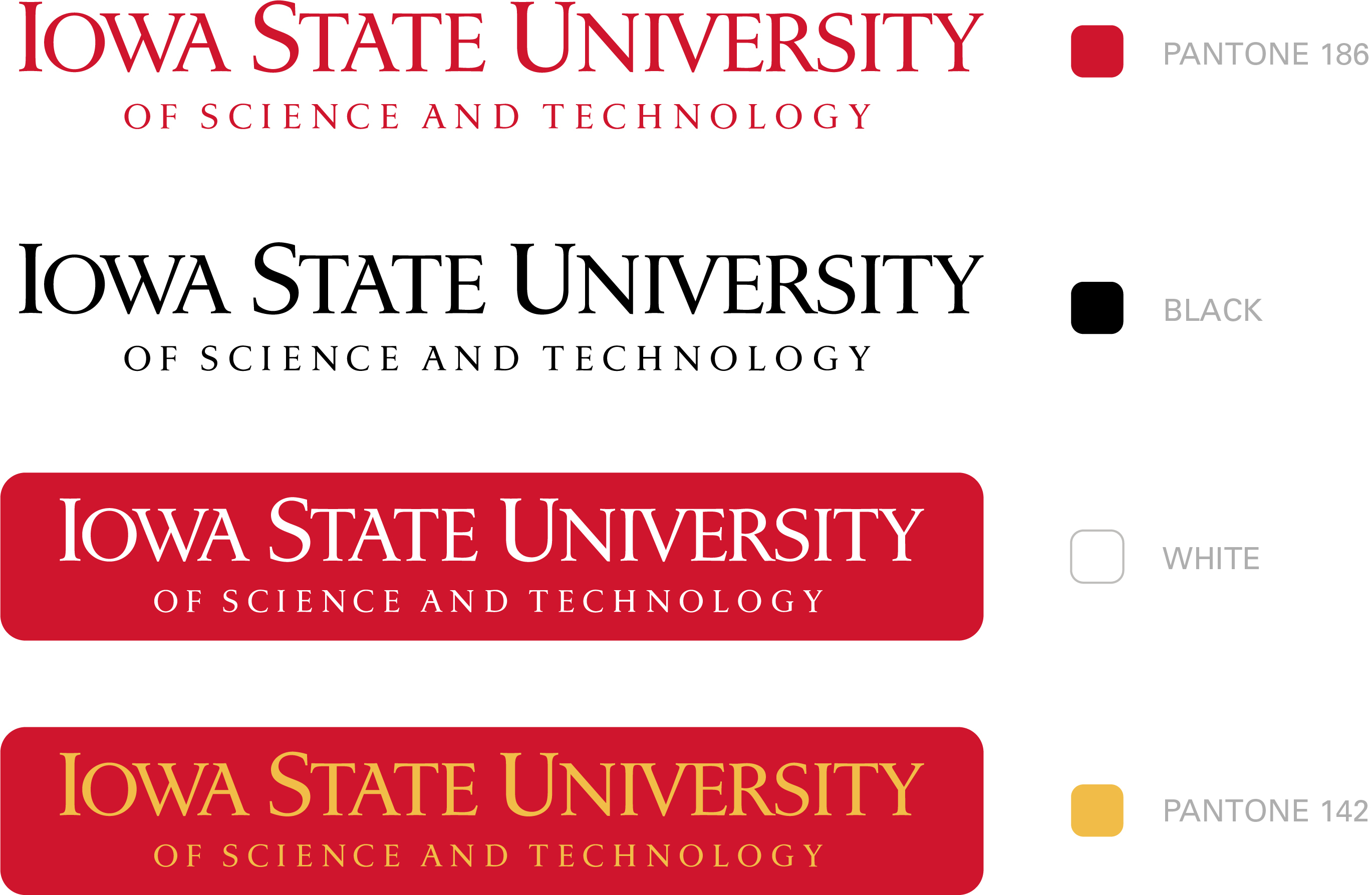
-
Minimum Size
The size of our wordmark's large capital letters (I, S, or U) should be no smaller than 1 pica (.17 of an inch) in cap height, to ensure sharp and legible reproduction. The size of the modifier, when used, is determined by making the height of the first capital letter in the unit name equal to half of the height of the cap “I” in the wordmark.

-
Trademark Symbols
When the wordmark appears on apparel, it should always have a ® registration notice. When the wordmark appears on any other type of merchandise, including display banners, the ™ notice should be used. The ® and ™ notices are not needed on stationery, marketing collateral or interactive communications.
Correct placements for both the ® and ™ notices with the wordmark are shown below. For your convenience, these have already been created for you and are available for download.
Registration
Trademark