Color Palette

-
Primary Palette
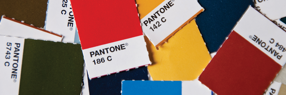
The primary palette consists of five colors, which are led by the university's two signature colors, cardinal (Pantone 186c) and gold (Pantone 142c). These colors may be used extensively both for large areas of color or as an accent color. Screens or tints of the primary colors may be used to achieve a desired effect, however, screening the red shades will result in pink, which should be avoided altogether.
- pantone 186 C
- cmyk 2 100 85 6
- hex #C8102E
- rgb 200 16 46
- pantone 142 C*
- cmyk 0 24 78 0
- hex #F1BE48
- rgb 241 190 72
- pantone 449 C
- cmyk 31 38 75 76
- hex #524727
- rgb 82 71 39
- pantone 451 C
- cmyk 21 15 54 31
- hex #9B945F
- rgb 155 148 95
- pantone 454 C
- cmyk 11 5 29 8
- hex #CAC7A7
- rgb 202 199 167
*Please note when using Pantone 142 on uncoated paper stock Pantone 7549U should replace Pantone 142.
**The above colors were confirmed with Pantone 12/16. -
Secondary Palette
The colors of the secondary palette have been selected to complement the primary colors and are designed to support and accent the primary palette and should not be used in exclusion of the primary palette. Their understated tones were chosen to work well as a subtle background behind typography or other graphics, or in other situations where a restrained use of color is desired. Screens or tints of the secondary colors may be used to achieve a desired effect, however, screening the red shades will result in pink, which should be avoided altogether.
- pantone 5743 C
- cmyk 54 24 86 73
- hex #3E4827
- rgb 62 72 39
- pantone 7496 C
- cmyk 46 6 100 42
- hex #76881D
- rgb 118 136 29
- pantone 5777 C
- cmyk 26 9 56 20
- hex #A2A569
- rgb 162 165 105
- pantone 548 C
- cmyk 100 21 28 76
- hex #003D4C
- rgb 0 61 76
- pantone 307 C
- cmyk 100 22 2 18
- hex #006BA6
- rgb 0 107 166
- pantone 5425 C
- cmyk 45 16 9 24
- hex #7A99AC
- rgb 122 153 172
- pantone 1815 C
- cmyk 16 97 86 54
- hex #7C2529
- rgb 124 37 41
- pantone 484 C
- cmyk 8 92 100 33
- hex #9A3324
- rgb 154 51 36
- pantone 167 C
- cmyk 5 77 100 15
- hex #BE531C
- rgb 190 83 28
- pantone 464 C
- cmyk 11 53 94 53
- hex #8B5B29
- rgb 139 91 41
- pantone 465 C
- cmyk 9 29 66 24
- hex #B9975B
- rgb 185 151 91
- pantone 7403 C
- cmyk 1 11 58 2
- hex #EED484
- rgb 238 212 132
- pantone Warm Grey 11 C
- cmyk 26 36 38 68
- hex #6E6259
- rgb 110 98 89
- pantone 424 C
- cmyk 30 20 19 58
- hex #707372
- rgb 112 115 114
- pantone Warm Grey 5 C
- cmyk 11 13 16 32
- hex #ACA39A
- rgb 172 163 154
*The above colors were confirmed with Pantone 12/16.
-
Color Combinations to Avoid
Color is one of the most powerful ways a university can identify itself. Used consistently, the colors chosen to represent Iowa State create a strong identifying image. Conversely, some colors and color combinations can be confusing.
Colors associated with other public institutions, such as the one on the eastern side of the state, should not be used. Even though gold is one of Iowa State's primary colors, use of black and gold together should be avoided. Purple is not within any of Iowa State's color palettes and should never be used.
*The above colors were confirmed with Pantone 12/16.
-
Interiors and Wall Paint
If you need paint, the following matches the university's brand color of Pantone 186C. Please request from your local Sherwin Williams paint dealer.
- Pantone 186
- SW 6868
- "Real Red"
- Pantone 142
- SW 6677
- "Goldenrod"
