Wordmark
"One way to get the most out of life is to look at it as an adventure" - William Feather
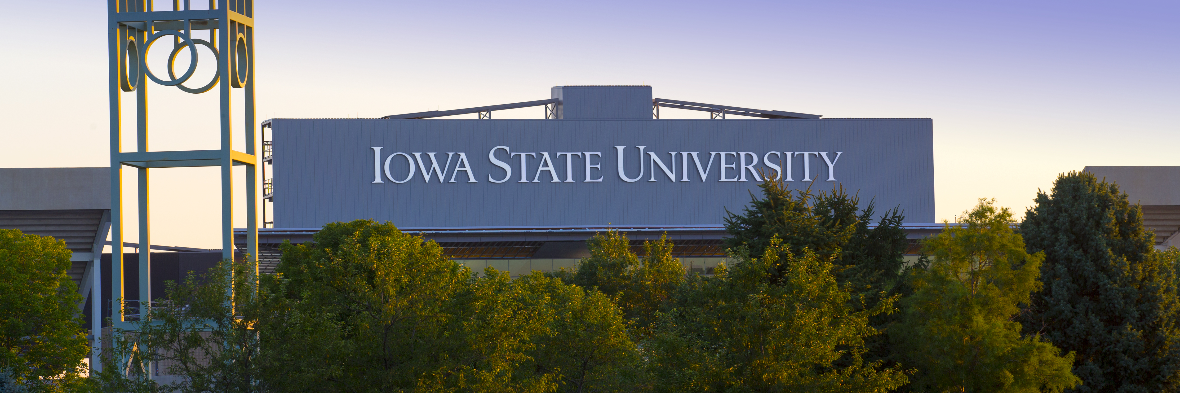
The Iowa State University wordmark is the standardized graphic representation of the Iowa State University name. The wordmark consists of letterforms customized especially for Iowa State University. It is not a specific font.
In the wordmark, each word receives equal weight to convey the equally significant values of Iowa State’s location, classification as a state-related institution, and status as a full-fledged university. The combination of caps and lower caps, always a more classical choice, expresses the enduring power and strength of this institution with chiseled precision. This relationship between the initial caps and the rest of each word is custom-created. Rather than ego driven large caps, the I, S, and U are carefully modulated as a respectful nod to Iowa’s native modesty.
The wordmark anchors the entire visual identity system and the beauty and appropriateness of the visual identity lies in its systematic approach.
Official name wordmark:

Abbreviated name wordmark:
![]()
The consistent and proper use of the university wordmark not only strengthens recognition for Iowa State University, but also encompasses the many individual entities that make up the university.
Do not attempt to typeset or recreate the wordmark. Instead, the university-created digital file should be used. NO OTHER LOGOS, SYMBOLS OR TYPE TREATMENTS should be developed or used by colleges, departments, divisions, units, centers or institutes as they distract from the emphasis and identity of the university.
Specific university wordmark guidelines have been developed to ensure consistent and proper usage. Downloads of the various university wordmarks are available.